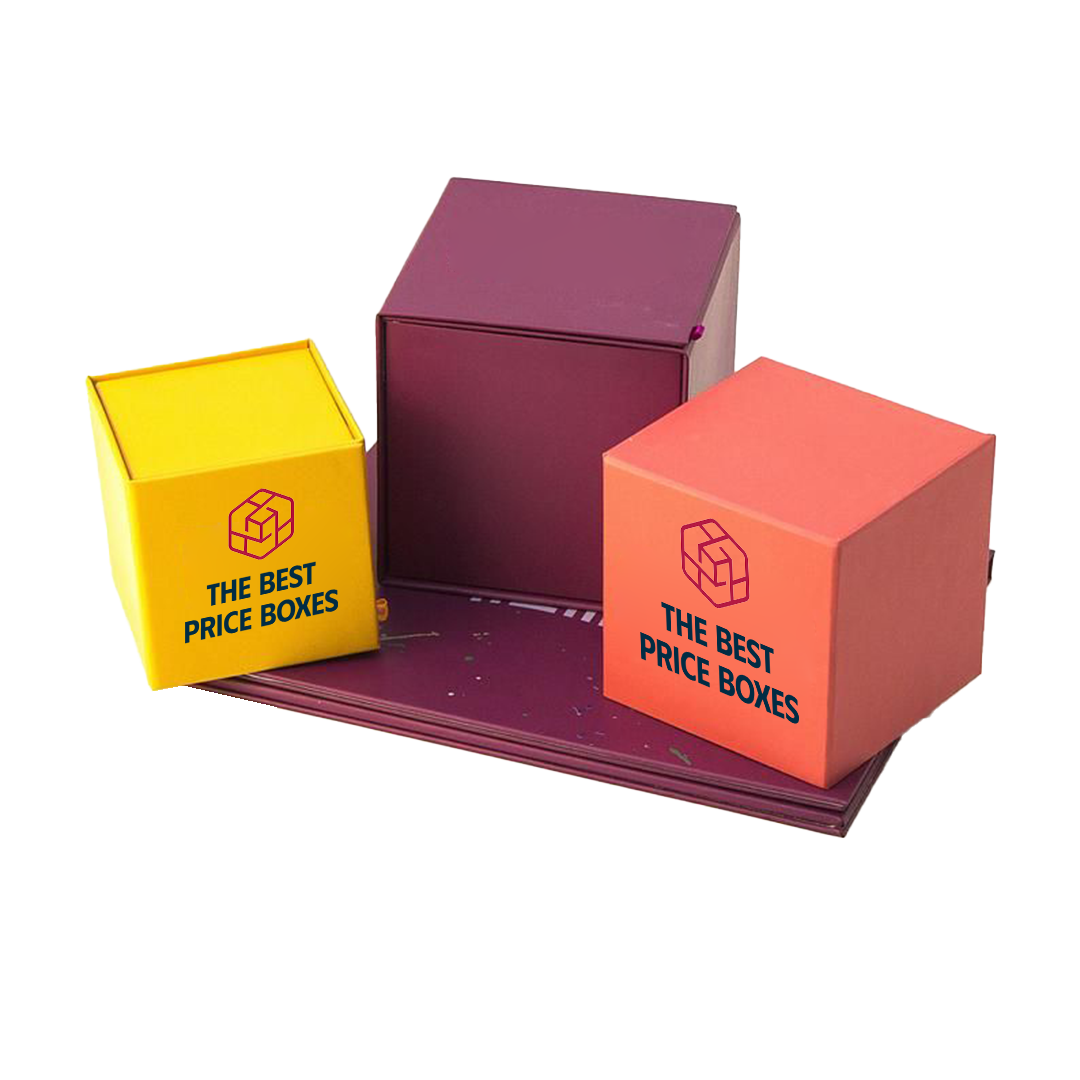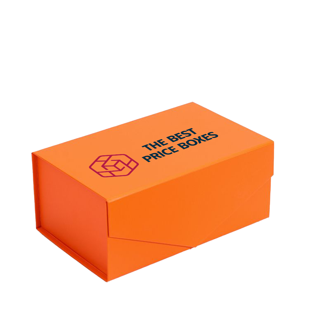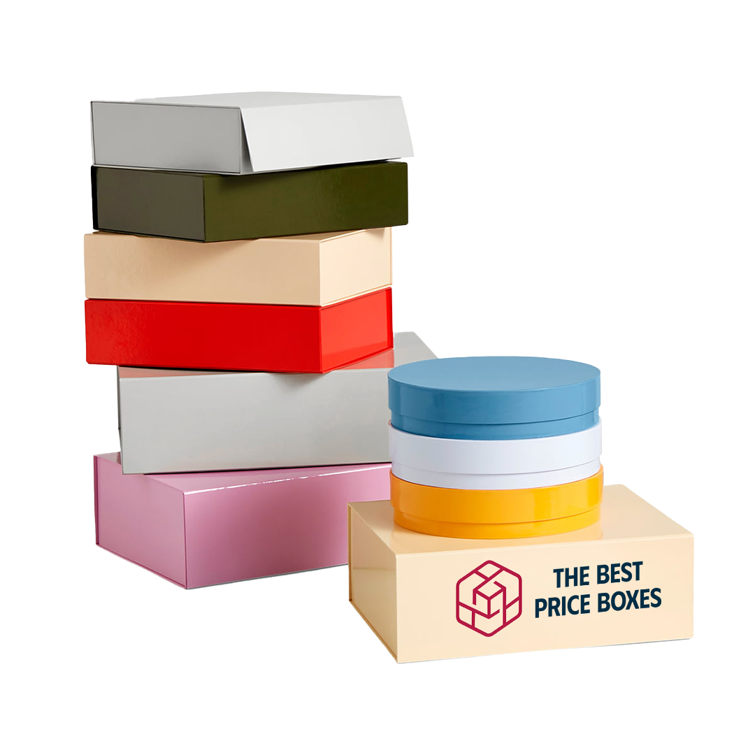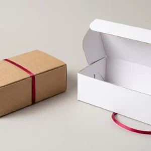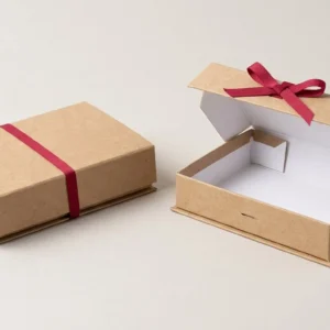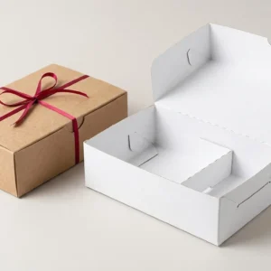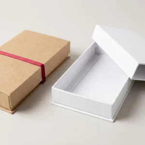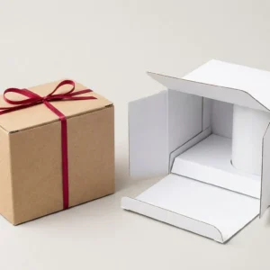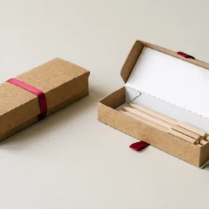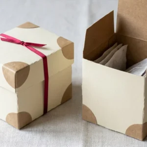
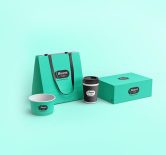

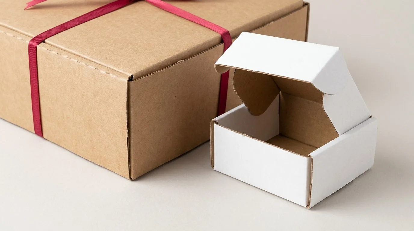
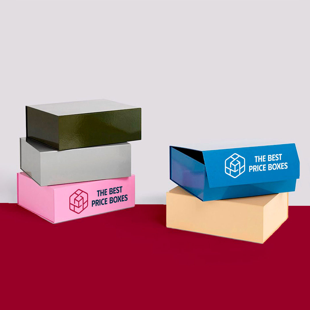
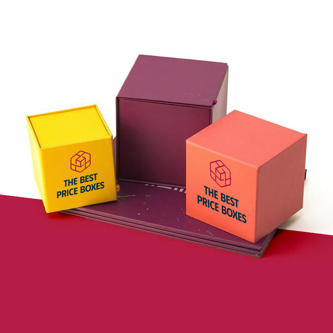
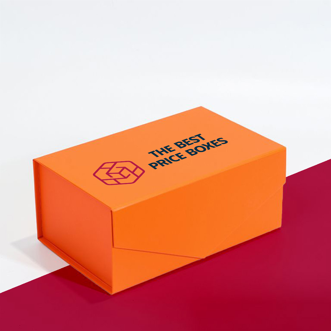
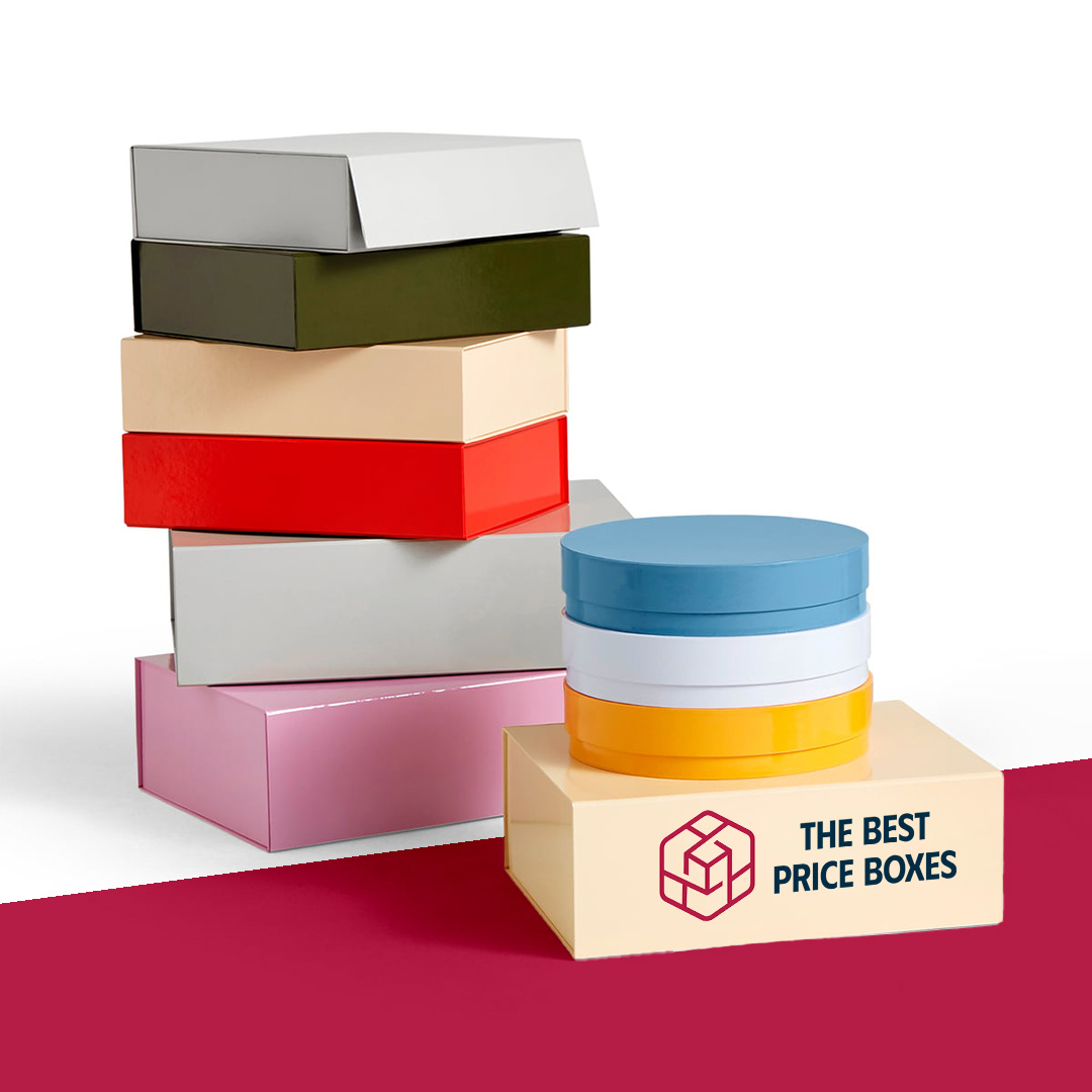


Colored boxes are custom cartons finished in a solid, saturated color, without a busy design on top, so the color itself carries the brand. TBPB makes them to your size and a matched color with no minimum order, and a written quote for matching specifications is beaten by our price-beat guarantee.
The hard part is getting the same color twice
Printing a solid color sounds simple until the second batch looks different from the first. Large flat areas of ink show every variation, so the way to protect your brand color is to specify it as a Pantone match instead of a CMYK mix, and to approve a printed sample before a run. A spot color is mixed as one ink to a published formula, so it holds more steadily across batches than four-colour blends. Ask us to match the Pantone number your brand guide uses, and keep the file in that colour mode.
The board changes the colour, too. The same ink looks different on bright white board, on kraft and on a coated surface. If your colour is critical, say so before the run, and compare against a physical swatch rather than a screen.
Printing a solid color versus using coloured stock
There are two routes. Printing a solid onto white board gives the widest range of colours and tidy edges. Coloured paperboard, where the board itself carries the tint, limits you to the shades available but avoids large ink coverage and any risk of cracking at the folds. Dark, heavy ink coverage can crack along crease lines on folded cartons, particularly on tuck flaps, so a coating or a varnish helps, and heavily inked areas should be kept away from sharp folds where possible.
Finishes that make a single colour feel deliberate
A flat colour box can look plain unless the finish is chosen with care. Soft-touch lamination turns a deep colour into a velvety surface and hides fingerprints reasonably well. Gloss aqueous coating brings out bright shades. Matte coating calms them. A foil logo or a spot UV pattern on a matte background gives contrast without any extra colour. Embossing the name adds texture where the eye expects detail.
- Solid-colour folding cartons, tuck-top, lidded or sleeve styles
- Pantone-matched ink on white board, or tinted paperboard
- Matte, gloss or soft-touch finishes, foil, spot UV, embossing
- Optional inside print in a second colour
- Made to your product dimensions in any quantity
Inside the box matters too
A bold outer colour sets expectations, so what the customer sees when the lid lifts should follow through. A contrasting inside colour, a white interior or a printed pattern keeps the reveal interesting. Tissue paper in a matching or complementary shade finishes it. If the exterior is a heavy solid, keep the inside lighter so the product shows clearly, and avoid dark ink on the inner surface where goods might rub. Small details like this stop a simple solid-colour pack from feeling flat.
Where colored boxes fit best
They suit brands whose colour is the identity: a skincare line, a gift range, a subscription kit or a product family. A solid box looks good next to a strong label. If you want a rustic feel instead, kraft die-cut boxes are better. For a luxury gift look, consider luxury gift boxes. Plain chipboard boxes work when you want a flatter base to build your own look. The wider custom retail packaging range has more.
To quote, send the product dimensions, your Pantone number and the quantity, even one. We will draw the dieline and price it.
Frequently asked questions
How do I make sure my brand color prints accurately?
Specify the colour as a Pantone number rather than a CMYK mix, and approve a printed sample before the full run. Spot ink follows a fixed formula, so it holds steadier across batches than four-colour blends.
Is there a minimum order for colored boxes?
No. TBPB has no minimum order. You can order a single box to check how your colour looks on board, or thousands for a launch. The dieline is drawn to your product size.
Should I print a solid color or use coloured stock?
Printing gives you any shade and crisp edges, while coloured stock limits the palette but avoids heavy ink coverage. Heavy solids can crack at folds, so ask us which suits your style and colour.
Why does my colour look different on kraft?
Kraft board is brown, so ink sits over a darker base and shifts the shade, softening bright colours. White board shows colour most truly. Compare a printed sample against your Pantone swatch.
What finish suits a solid-colour box?
Soft-touch lamination gives a deep colour a velvety surface, gloss brightens, and matte calms. A foil logo or spot UV adds contrast without a second ink colour.
Can TBPB beat a quote I already have?
Yes. Bring a written quote for the same size, board, colour match and quantity, and TBPB will beat it. Send the specifications and we will confirm.
More Custom Retail Packaging
See the full Custom Retail Packaging range, or explore related options with no minimum order and our best-price guarantee: