

Working on a box design? Get a free dieline and a quote in minutes
Free design help, free dielines, free samples, no minimum order, and we beat any competitor’s written quote on a like for like specification.
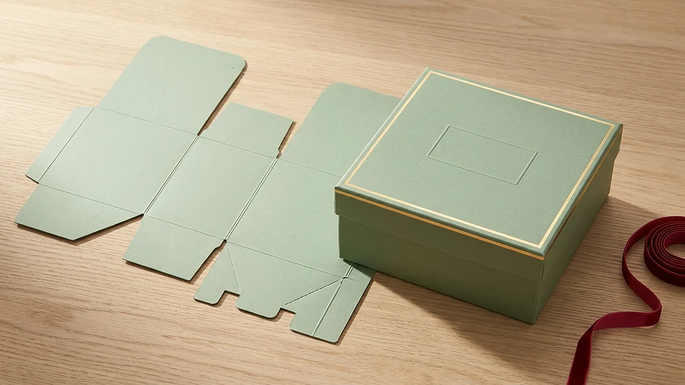
Box design starts with a dieline, not a rectangle. A dieline is the flat, unfolded map of your box with every cut, crease and glue flap marked on it, and designing on top of one is the difference between a box that prints clean and a box that arrives with your logo folded in half. We send a free dieline with every quote, so you never have to guess at the shape. What follows is how to use it, and where most first designs go wrong.
Design on the dieline, not on a blank canvas
A flat sheet gives you no idea which part of your artwork ends up on the lid, which part disappears under a glue flap, and which part lands upside down once the box is folded. The dieline tells you all three. Put it on its own locked layer at the top of your file, draw underneath it, and switch it off before you export.
Most dielines use the same three line conventions. Solid lines are cuts. Dashed lines are creases, which is where the board folds. Dotted or shaded areas are glue. Those three tell you almost everything you need to know about where art can live and where it cannot.
Bleed and safety: the two numbers behind most reprints
- Bleed: 0.125 in past every outside edge. If your background is meant to run to the edge of the panel, it has to actually extend a full eighth of an inch beyond the cut line. Cutting has a tolerance. Without bleed you get a hairline of bare board along one edge, and on a dark box it is the first thing anyone notices.
- Safety: 0.25 in inside every trim and crease. Keep logos, text and anything you would be upset to lose at least a quarter inch away from a cut line, and the same distance from a fold. Type that sits on a crease gets creased.
That second one catches people constantly. A layout can look balanced on screen and still put a tagline directly across the fold between the front panel and the top. Once the box is assembled the sentence has a valley through it.
Build in CMYK, and expect the blues to move
Screens are RGB. Presses are CMYK. Anything built in RGB gets converted at output, and the conversion is not neutral. Bright blues go purple. Vivid oranges dull down. Neon greens more or less give up. If your brand blue matters, build the file in CMYK from the start so you are looking at something close to the printed result while you work, and give us the Pantone reference if you have one.
Images need to be 300 dpi at the size they sit on the page, which is not the same as 300 dpi before you scaled them up. A logo pulled off your own website is usually 72 dpi and around 400 px wide. Enlarged onto a box panel it turns to mush. Ask your designer for the vector file. If nobody has it, we can usually redraw a simple mark as part of the free design help.
Work out which panel people actually see
Boxes are not viewed evenly, and designing every panel with equal care wastes money and attention. Think about how yours will be encountered.
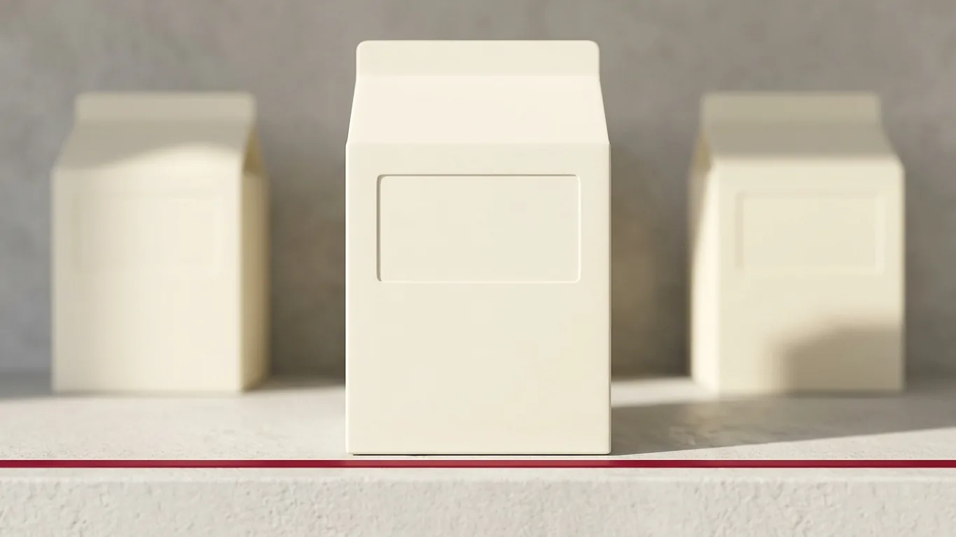
- Retail shelf. The front panel and roughly the top third of it do all the work. Put the product name and the one fact that sells it there.
- Ecommerce mailer. Nobody sees the outside except a courier. The inside of the lid is your moment, because it is the first thing the customer looks at when the box opens. Printing the interior costs more than most people expect it to be worth, and it is one of the few upgrades that reliably shows up in unboxing photos.
- Gift or subscription. The lid and the first inch of the side. That is the part visible when the box sits closed on a table.
- Every box. The bottom panel is where regulatory copy, barcodes and your website go. It is not wasted space, it is the right space for the dull material.
Where not to put ink
The glue flap. Adhesive does not bond well through heavy ink coverage, and a box that pops open in transit is a returns problem, not a design problem. Leave the glue area clear, or accept a knocked out patch where the flap lands.
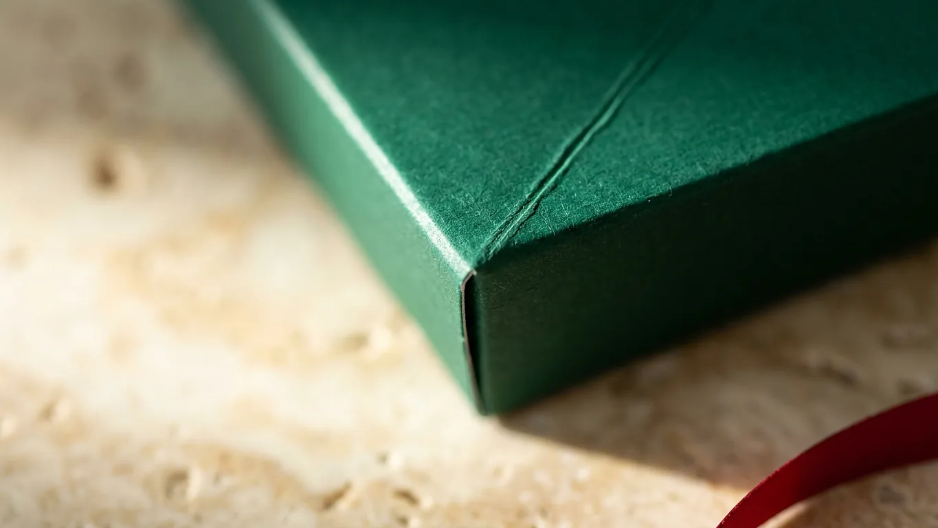
Straight across a crease, if the ink is dark and heavy. Board folds by compressing on one side and stretching on the other. A solid dark field stretched across that fold shows a fine pale line where the coating splits. On 14 pt stock it is barely visible. On 24 pt with a matte laminate it is obvious. Scoring before folding is standard on our end, and it is what keeps that crack from opening up, but a design that puts a solid black fold line down the front of the box is still asking for trouble.
Over a barcode. Barcodes need a quiet zone, a clear margin on both sides, and dark bars on a light ground. A barcode reversed out of a dark panel often will not scan. Keep it flat, keep it off folds, and give it white space.
Board changes the color you designed
The same file prints differently depending on what it lands on, and this surprises people more than anything else in box design.
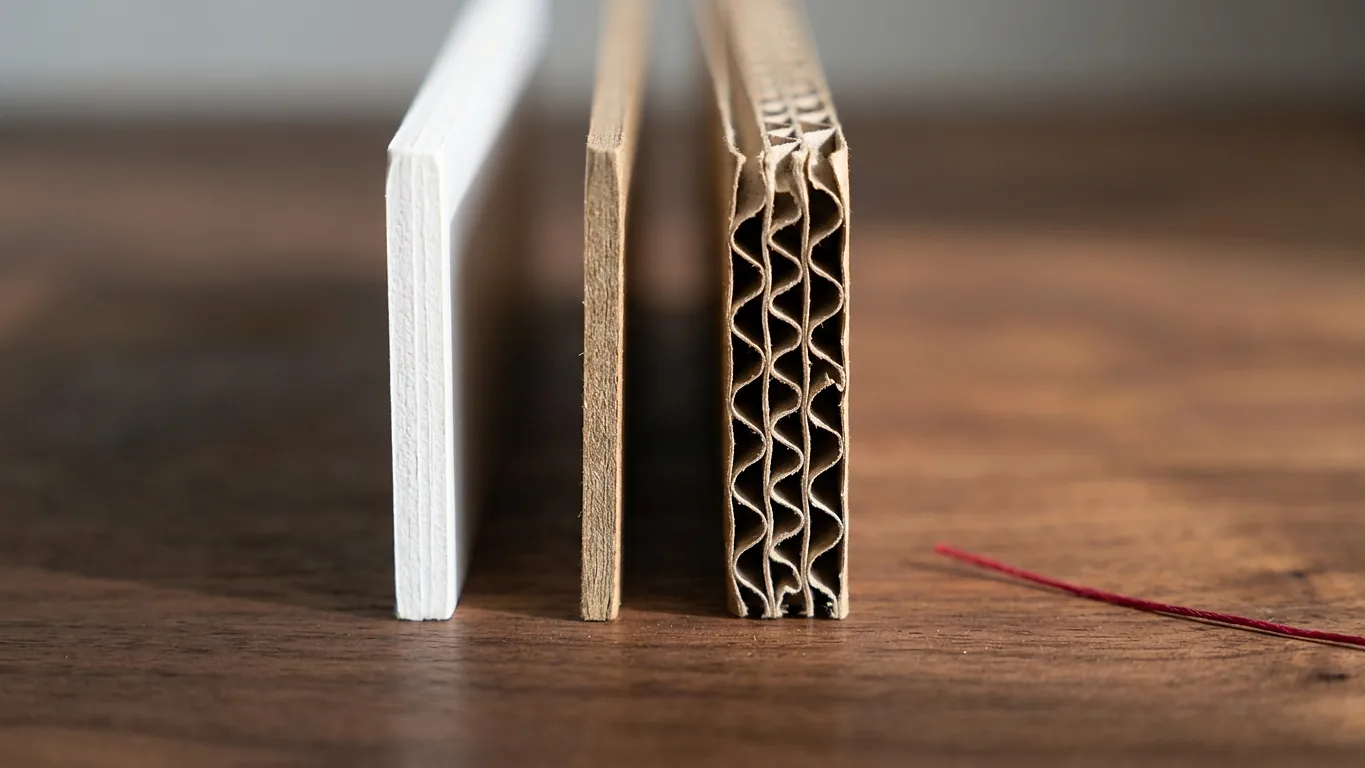
- SBS, white and coated, in 14 pt, 16 pt, 18 pt and 24 pt. Colors sit where you expect them. This is the default for cosmetics, food and anything where the printing is the point.
- Kraft, uncoated brown. Every color shifts warm and drops in saturation, because brown is showing through. Pale blue turns gray. Yellow nearly vanishes. Design for kraft deliberately, in a limited palette with strong contrast, or add a white underprint and accept the extra pass.
- Corrugated, E-flute at roughly 1/16 in for retail mailers and B-flute at roughly 1/8 in for shipping. The flute is a wave of paper between two liners, and on heavy ink coverage you can sometimes read the wave through the print. Fine detail and small reversed type do not survive on corrugated as well as they do on folding carton.
If board strength matters more than appearance, ask about ECT rather than caliper. A 32 ECT corrugated box is a common baseline for shipping, and it is a stacking strength rating, not a thickness.
Finishes worth the money, and one that usually is not
Matte lamination hides handling marks and makes photography look calmer. Gloss makes color pop and shows every fingerprint, which is fine on a shelf and less fine on a gift box. Soft touch is the one people comment on out loud, and it is the finish most likely to make a modest box feel expensive.
Spot gloss over a matte laminate, on one element only, is the cheapest trick in the trade for making a box look like it cost more than it did. Foil stamping does the same job with more presence. The upgrade I would think hardest about is full coverage foil, which costs real money and often reads as less refined than a small foil mark on a restrained box. There is a longer comparison in our guide to foil stamping and spot UV.
What to send us
- A print ready PDF or native AI file, built on our dieline, at 100 percent scale.
- Fonts embedded or outlined. Missing fonts substitute silently and nobody notices until the proof.
- Dieline on its own layer, named, switched off or set to non printing.
- Pantone references for any brand color that has to match.
- A note on board, finish and quantity, even a rough one. It changes what we recommend.
You get a digital proof before anything runs, and on structural work we can send a physical sample so you can fold it, load it and see whether the size is actually right. Most delays on a first order come from file setup rather than printing, so send what you have early and let us check it. It takes minutes on our end and saves a week on yours.
Not sure what size you need yet? Start with the box size calculator, then look at the shapes in our guide to folding carton styles. When you know the format, the money pages for custom mailer boxes and custom rigid boxes cover specs in detail. Every one of them is printed with no minimum order, so a first design can go to press in the quantity you actually need.
Box design FAQ
What is a dieline in box design?
A dieline is the flat, unfolded outline of your box with every cut, crease and glue area marked on it. Solid lines are cuts, dashed lines are folds, and shaded areas are glue. You design on top of it so you know exactly which artwork lands on which panel once the box is assembled. Designing without one is the most common reason a first box comes back wrong, because a layout that looks balanced flat can put your logo across a fold. We send a free dieline with every quote.
How much bleed does a box design need?
0.125 in of bleed past every outside edge, with the artwork genuinely extending into it rather than stopping at the cut line. Cutting has a tolerance, and without bleed you get a thin line of bare board along an edge. Separately, keep live type and logos 0.25 in inside the trim and the same distance clear of any crease, because type that sits on a fold gets creased and stops reading cleanly.
Should box artwork be RGB or CMYK?
CMYK. Screens display RGB and presses print CMYK, so an RGB file gets converted at output and the conversion shifts color. Bright blues move toward purple, vivid oranges go flat, and saturated greens lose most of their punch. Building in CMYK from the start means you are looking at something close to the printed result while you design. Supply a Pantone reference for any brand color that has to match exactly.
Why does my color look different on kraft board?
Kraft is uncoated brown board, so the brown shows through the ink and shifts everything warm while cutting saturation. Pale blues read gray and yellows can nearly disappear. You have two honest options: design for kraft on purpose with a limited high contrast palette, or add a white underprint so colors have a neutral base to sit on. White coated SBS is the choice when the printing itself is the selling point.
What file format should I send for box printing?
A print ready PDF or a native Illustrator file, built on the supplied dieline at 100 percent scale, in CMYK, with fonts embedded or outlined and images at 300 dpi at their placed size. Keep the dieline on its own named layer, set to non printing. Add a note on board, finish and quantity. Send it before you finalize anything if you are unsure, because a file check takes us minutes and a rebuild takes you days.
Can you help if I do not have a designer?
Yes. Free design help and free dielines come with every quote, and for a straightforward layout we can set the artwork up on the dieline for you from a logo and a description of what you want. If your only logo file is a low resolution image pulled from a website, say so, because a simple mark can usually be redrawn as vector so it prints sharp at any size.